Hacker Read top | best | new | newcomments | leaders | about | bookmarklet login

Here are some simple visualizations of this data: https://gist.github.com/breck7/b88155a58cbf83d32283b9ea50bf8...


sort by: page size:

Not sure if I'm helping but here's my attempted visualization[0]

0: https://gist.github.com/numpad0/6e77028ab3e073e4b02f17cf50d0...


I've also done a visualization: http://www.darynr.com/kmeans.htm

I made this [1] not so long back to visualize a bunch of statistical distributions. [1]: https://jeffreyjose.com/stats/dist/

I made this [1] not so long back to visualize a bunch of statistical distributions. [1]: https://jeffreyjose.com/stats/dist/

Visualization of this data from almost 20 years ago - I used it as example data for my PhD thesis:

http://mepalmer.net/ibb/

The views are all pre-rendered. Sorry for the old school site, circa 1996!


Graphs for Data Science: https://graphs4sci.substack.com/

Visualization for Data Science: https://viz4sci.substack.com/

</ShamelessPlug>


Another visualization, using JS to solve the Langrangian: https://matthewarcus.github.io/lagrange/

I put this on another comment, but I like it so much I'll do it again here.

This is fabulous, and pretty much the graph you're looking for: https://anvaka.github.io/map-of-github/


Reminds me of this poetic data visualization: https://www.theatlas.com/charts/HJFYm4uQ-


Here's a cooler (imo) visualization: https://willymaps.github.io/nyctrees/

This is a much more fun visualization of the same data - http://www.youtube.com/watch?v=kUldGc06S3U

Shameless promotion of my list of data visualization resources: https://github.com/fasouto/awesome-dataviz

Relatedly, here’s some cool visualization work that comes from genetics data viz.

http://scalable-insets.lekschas.de/


It looks quite similar to a graph visualization method I once used in Gephi [1].

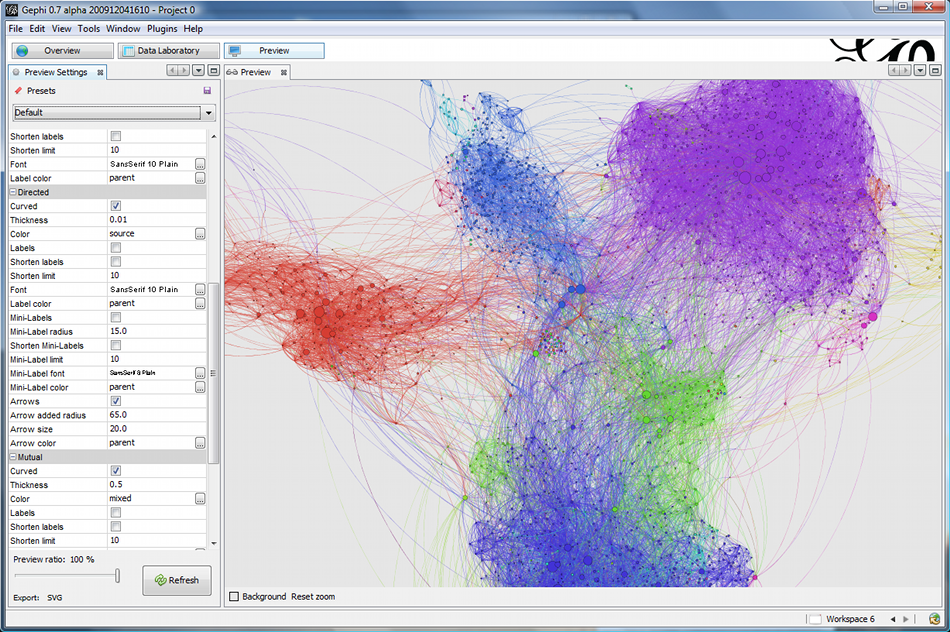
[1] https://gephi.github.io/images/screenshots/preview4.png


next

Legal | privacy