Hypothesis: population growth looks like /, while public land growth looks like - or \ (e.g. cursory search for statistic shows federal acreage drop of 4.9% from 1990 to 2018)
What inferences can be made from this?
Many of the states that seem to be holding out have low populations so the real picture may be far more bleak than it appears...
see a population density corrected map here: http://www.pnas.org/content/101/20/7499/F1.expansion.html
It would also be worth looking at the geographic distribution. I suspect that most of that growth is from urban areas. Which, then, would also reflect the ongoing urbanization (and corresponding rise in demand).
This... Makes perfect sense. And it's really odd that the population would increase instead of decreasing, for obvious reasons.
Whatever the case, there must be something wrong with millennials and younger, but I'd bet it's more likely to be overreporting instead of underreporting.
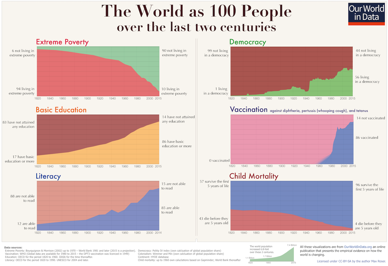
I've been thinking about the deceptiveness of the graph on the top left lately. It's easy to look at proportions and see that things have improved, but I don't know anyone who morally weighs suffering this way. When you take the graph and adjust for population growth, we get a decrease from 94 (out of ~100) to 70 (out of ~700). In absolute terms the impoverished population has been reduced roughly 25% over the past 200 years. I suspect there's also a lot of room for error dating back this far, and it's entirely possible that things have barely changed (or even become worse) in absolute terms. I've grown tired of the use of this term; it only seems to obscure.
Probably because the base is changing fast enough that it’s hard to compare percentages of the total population over time. Geometric growth is kind of hard to follow.
Ah; it looks like my impressions are /somewhat/ out of date: https://www.ppic.org/publication/whats-behind-californias-re...
Although I’d say trying infer things from numbers during the pandemic is going to, uh, run into some pretty serious confounding factors. Still, looks like the trend was happening /before/ that, so.
First off, the statement describing the graph ("The following graph shows the number of births in the United States 1957 to 2007. Data is presented every 10 years.") is a bit odd. The graph shows the number of births per year for 6 of the 51 years from 1957 to 2007, at 10 year intervals. That's not really "the number of births in the United States 1957 to 2007." But let's say that's fine. Then they ask, "During which period(s) was there a decline in the number of births?" There is no such thing as "a decline in the number of births." The number of births always increases. There can be a decline in the rate of births per time, e.g., the number of births per year. But giving the number of births per year every ten years is not enough information to make a complete statement about births per time during the ten year periods. There may have been (and probably were) declines during each of those periods. In other words, it is impossible to "click all that apply."
reply