Does that report mention consumption anywhere?
This article is about consumption, not production, so it doesn't really make sense to compare this report to the article.
It doesn’t use average usage to calculate the remaining range, it uses EPA numbers which are 200 Wh/mi or less. Which, interestingly, is less than the consumption shown on the Monroney sticker. How they can show two contradictory numbers on the same official document is fascinating to me.
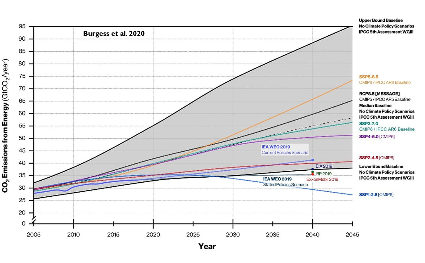
The text says one thing, but the graph they display to support their argument does not say what I thought it said.
The purple line is supposed to be our "real" emissions, and the impression you get from the image and text is that our real emissions are much lower than the projected emissions.
But if you actually look at the values of the purple line vs the other lines now, in 2020/2021, the values are almost exactly the same.
I don't understand how to reconcile that with the text.
I thought those numbers sounded a little exaggerated and hand-wavey too. I highly doubt this takes into account things like emissions from vehicles used to transport the meats, for example.
That is not what I am arguing at all. I am merely pointing out that it is unclear as to what the ecopassenger.com website is calculating and what we can gather from this information.
The bar chart "food transport and production emissions" is misleading. If they had shown the charts at the same scale, the bars in the left one would only be 40% as long as they are now (range: 0-0.8 vs 0-2).
That's a fair point, although I'm not sure I'd personally categorize it as "actively deceptive", I agree it could be a lot clearer about "Emissions", and empirically you're clearly right that is has some folks confused. To be charitable, like all science communication it's trying to simplify a very nuanced topic and probably could be improved. I do think the illustration of how leafblowers pollute at ~300x the rate a car does is largely true, and the GHG/environmental impact is a lot messier than just primary CO2 emissions.
(Disclaimer: I've never met or interacted with Nicole, but I know people that have, so I'm likely biased to assume good intent.)
Well, since the article didn't bother displaying the graph on my browser (that's the kind of thing quality sites do!), I got to the source, and it's not as bad:
Although its not easy to tell, the EIA's site could use some improvements in terms of clearly defining what the data displayed represents.
reply