Everything you need at least once week while driving in a car should be doable without taking your eyes from the road for more than a second. Radio, AC, window heating and such fall under this category.
And you have exactly the same amount of buttons on a screen anyway, they're just not physical.
Next, Previous, Pause, Play, Mute - I personally want them to be physical controls. On steering wheel ideally, on the dashboard otherwise. I use them multiple times a drive, and I don't want to take my eyes off the road to do them.
Same with seat heat, lights, wipers - anything I may want to do while driving, I want a button.
Setting up the exact shade of my dashboard light - that can be buried in a menu :D
Basically... when you say "Crazy how many buttons my normal car has" :
- You say that as a bad thing
- I see that as a brilliant thing... IFF done well:
Of course, physical buttons/levers/knobs can still be done well, or poorly.
Having many identical buttons in a confusing layout is just as bad as touchscreen - I have to look at them to use them.
Having buttons in a good, intuitive layout; especially buttons which are distinct from each other, as opposed to row of 6 buttons all the same, is brilliant. Even better if it's a distinct combination of buttons, knobs, switches, levers, etc - anything to help haptic feedback and intuitive access. Sometimes I think people who are against buttons may simply never had a car with good physical UI:/
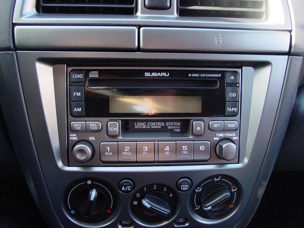
(simple thing - my old 2004 WRX has a next / previous knob-like-thing, rather than two identical buttons next to each other [1]. It felt ridiculous when I first saw it - but then I realized its quality of purpose vs sexiness - I never ever ever have to think or be distracted even a millisecond to know exactly how to skip a song :). Compare to cars which have several identical square buttons for next, previous, pause, play; or temp up, temp down, fan up, fan down, A/C -- that's just horrible UI by clueless people for customers who don't know / haven't experienced better :-/ ]
reply